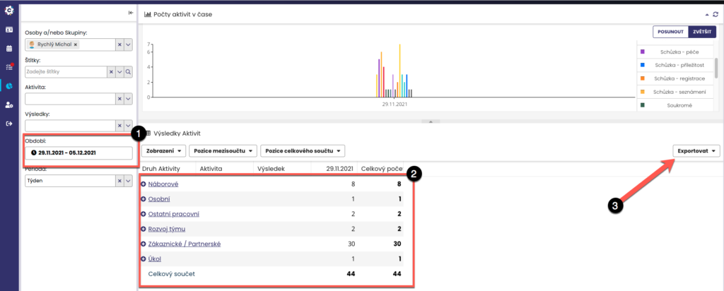
The Statistics module displays data aggregated for the entire structure as well as for individual collaborators. If the user does not yet have collaborators, the statistics will show only their own activities. You can easily set the period (1) to be displayed. Statistics are shown both in the form of a chart (2) and in the form of a table (2), which you can export to xls, csv or html (3).
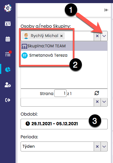
In the Statistics module, you can choose for which period the statistics will be displayed. By clicking on the Period field (1), a menu will appear from which you can select the required period (2), either from predefined options or by setting your own (custom (3)). By default, the current quarter is set to be displayed.
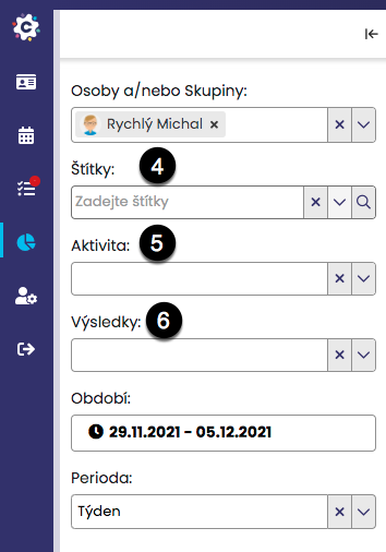
In the same way, you can set the display of only a specific group of contacts (labels (4)) or certain activities (5) or results (6).
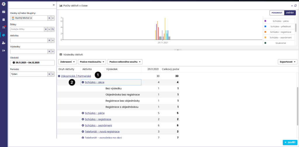
To display detailed information by type of activity, click on the selected type of activity, for example Client (1), and the activities falling under client activities will expand, which can then be further clicked through (2) to display the results of the activities.
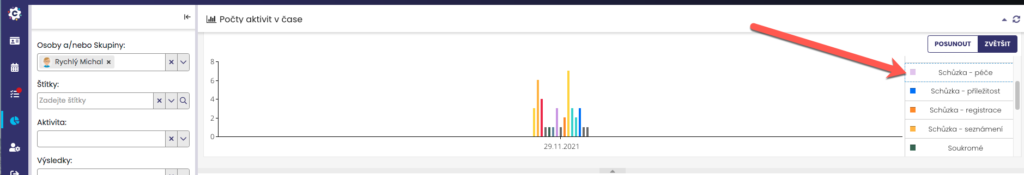
If you wish to hide certain activities in the chart, click on the desired activities in the chart legend > the activity in the legend will turn grey and will not be displayed in the charts. To display it again, simply click on the activity once more > it will be coloured and shown in the chart.
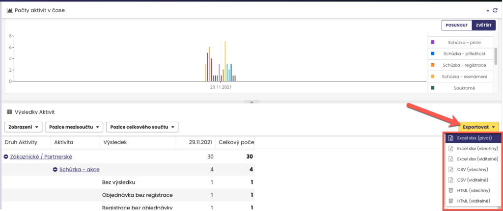
Data can be easily exported to xlsx, CSV or HTML format. By clicking on “Export”, a menu will appear – you can choose to export only the displayed values or all values, or directly export a pivot table from the data.
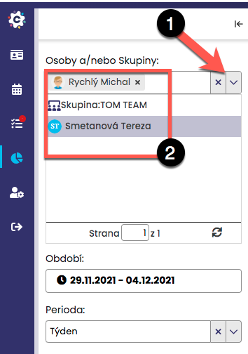
If you need to display the statistics of another team member or of an entire group, click on the drop-down arrow next to Person(s) or groups (1). A list of your colleagues and groups (aliases) will then be displayed (2). You can now find the relevant colleague or group in the tree and thus display the required data.